Barracuda Brand Refresh
In 2018 our internal creative team led a brand refresh for Barracuda Networks, which is an IT security company. Positioning customers as heroes and protecting them along their journey are key ideas. Additional initiatives I conducted were internal and competitor audits, and also target audience research to enhance the design process.
My focus
· Brand identity
· Corporate logo refinement
· Iconography
· Illustration
· Collateral system
This moodboard guided the below explorations which focused on the journey and protection idea
Each designer explored a big idea. I positioned Barracuda as a sidekick to the heroic IT manager.
Here was my main pitch.
Barracuda was considering a logo change so these explorations were a part of my big idea.
The team’s winning concept was tying the Barracuda fish into the journey story while showing customer protection.
The choice was to keep the original logo. The creative director gave it a facelift and I stepped in to fine tune the details (old logo and tagline shown in gray).
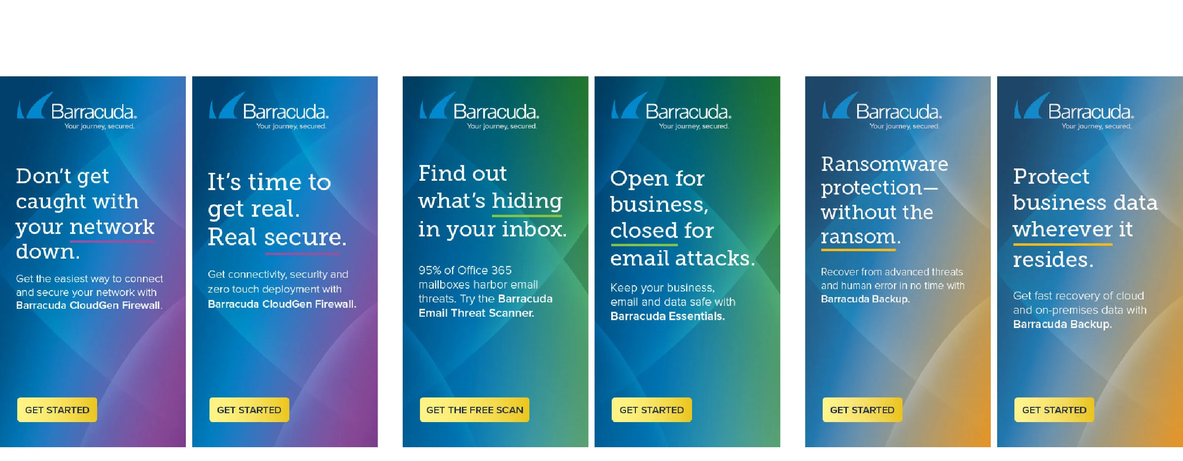
The color gradients I created represent product categories in web ads and other applications.
Mobile ad done in After Effects
Here are two twists to the ad backgrounds. The second announcement was a collaboration between another designer and I.
Here I innovated with the brand identity assets to stand out from the clutter at tradeshow events.
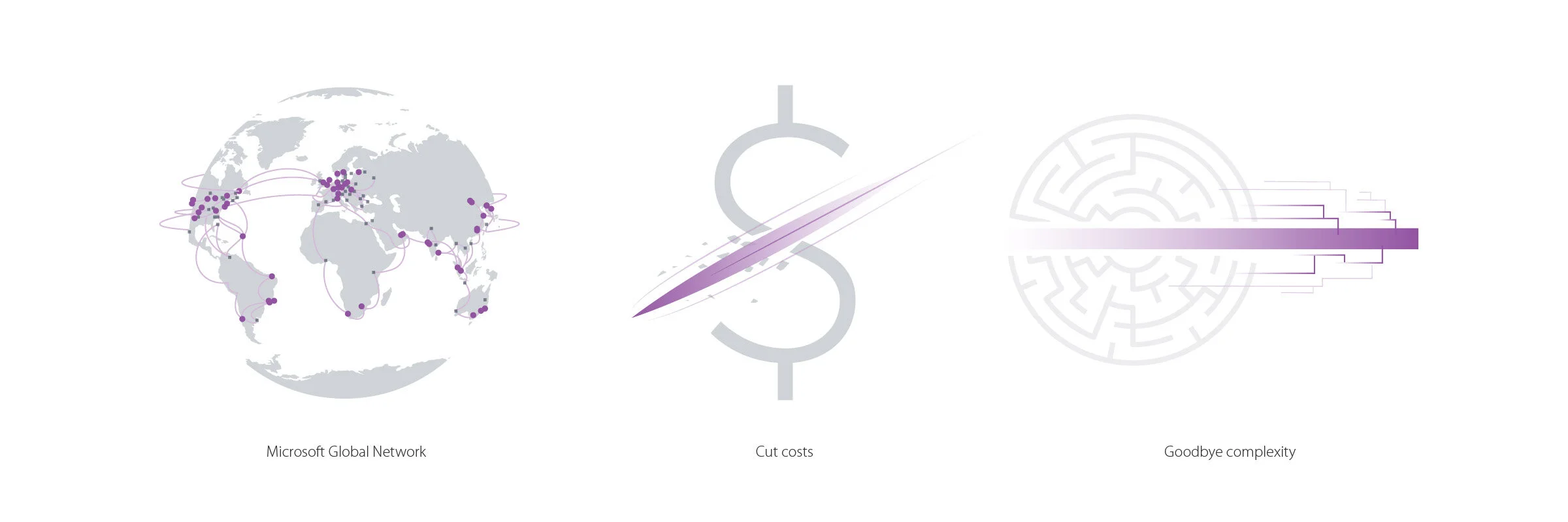
I created and managed the iconography style which utilized line segments and simplicity.
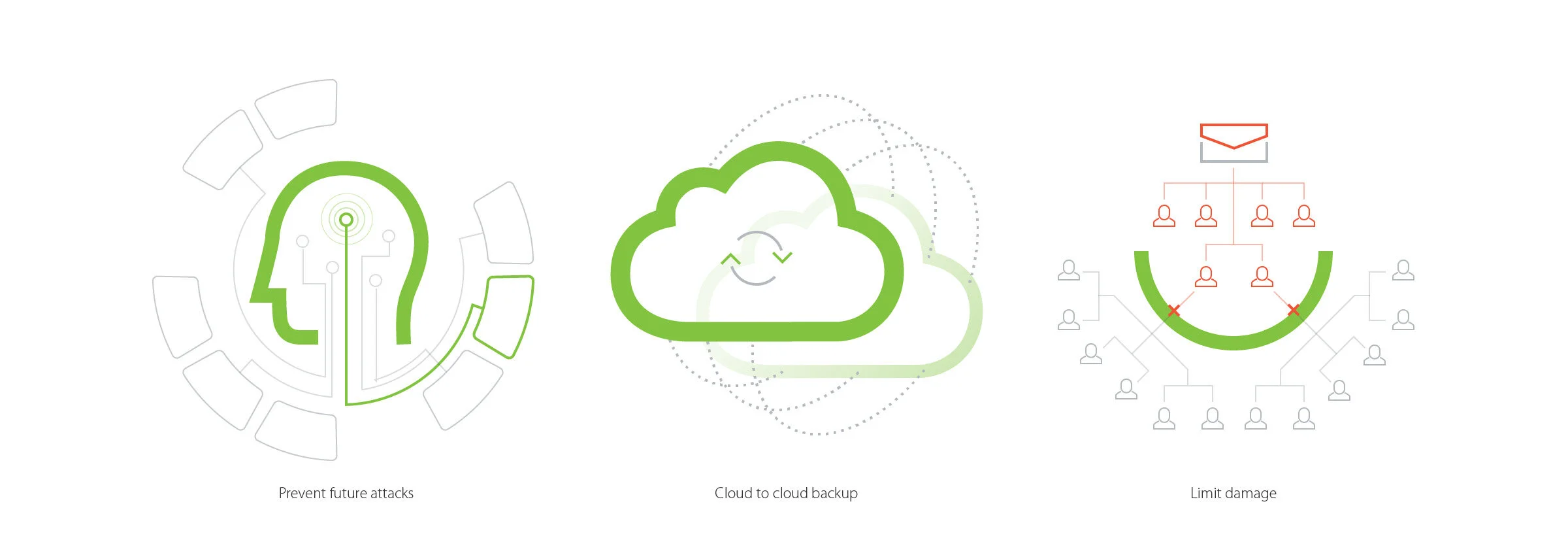
I created the illustration style which utilizes product category colors to emphasize where Barracuda plays its role.
I led the style of high level diagrams, which use clear typography and consistent visual language.
I created and managed the collateral system (from left: partner fact sheet, whitepaper, and case study).
I edited email template HTML/CSS for the brand refresh.


